Introducing Our New Look!
We’re excited to announce that we have been working hard on a refreshed brand, including a new logo, colors, and how we will position ourselves moving forward. Our refreshed brand will have a phased rollout, starting on July 13, 2020, and will include the launch of a new website.
Why The Change?
- With 89 years of proud service to the community, we wanted a brand that would better reflect this history, who we are today, and the impact our supporters are making possible.
- Our new brand communicates, in a fresh way, the heart of our mission—empowering individuals and families to learn, work, and thrive.
- The new brand also captures a belief that is foundational to our work—we can only succeed if we work together. Our logo recognizes the different partners that come together to give rise to possible.
What Is The Meaning Behind the Logo?
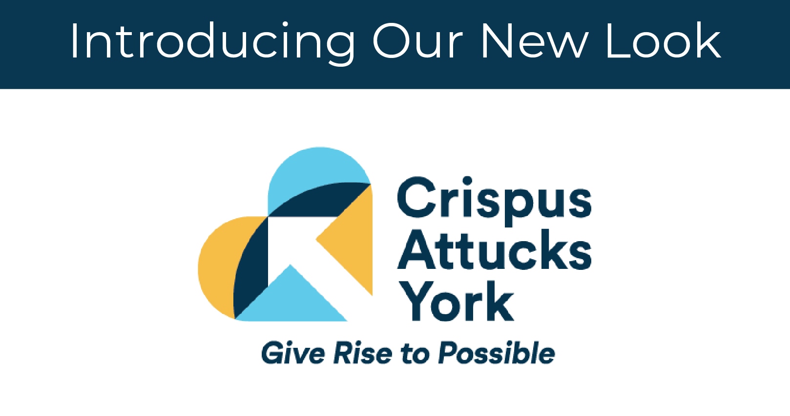
The refreshed logo and tagline speaks to the unlimited potential and full realm of possibilities that can be achieved through Crispus Attucks York. For those we serve, anything is possible.
The dark blue and gold color palette originates from the logo created at Crispus Attucks York’s founding in 1931, recognizing our history and honoring those who have come before us. The logo also represents our continued commitment to and compassion for the community and those we serve through the use of the heart, which has been our brand mark for over 10 years.
Within the new mark, the colors have been modernized through the use of a second light blue tone. The familiar heart shape is also composed of diverse, colorful pieces that represent the different programs and people that work together to equip the individuals and families we serve with a path for success. These partners are foundational to our work, and we could not do what we do without their support and guidance.
The pieces also come together to form an additional symbol, the arrow, which corresponds with the new tagline Give Rise to Possible, and captures how our staff and programs are continually striving for progress and achievement.
How Did You Go About Designing It?
The branding process has taken place in four phases over the course of three years: a research phase, a brand positioning and messaging phase, a creative phase, and an implementation phase. We started with a comprehensive research phase that included surveys, a communication and brand audit, and more.
These findings were used to create a brand identity document in the second phase, and information from both phase 1 and phase 2 laid the groundwork for the new visual identity and messaging in phase 3. We have now reached the implementation phase.
Let’s Give Rise to Possible, Together
We believe in helping people thrive and not just survive. We want to assist those we serve in finding their inner strength and discovering their inherent purpose. We want to empower and equip them to seek the unlimited possibilities that their future holds, but we cannot do this work alone. We’re so excited about our new brand, and we’re eager to move forward with you. Together, we can give rise to possible.
